Vocabulary Learning Mobile App
An Integrative Way To Learn a New Language & Connect With Others Around The Globe
Context
Keeping track of jargon when learning a new subject can be challenging. Students need a system to organize, reference, and learn new terms and concepts to progress confidently in their discipline.
People should be empowered to learn new vocabulary, even when they live busy lives. Thus, a mobile app designed for quick, on-the-go learning is key.
Role
UX Designer
Timeline
3 weeks
User Research
The user research phase was focused on what motivates people to learn a new language, and how to help users develop this learning into a routine. Through focusing on users' thoughts, feelings, and behaviors, we can access their underlying motivations and needs.
Key Findings
- A combination of different methods (e.g. flashcards, videos, quizzes, conversations, games, etc.) is preferred
- Daily reminders help greatly with task completion rate
- A gamified reward system would increase motivation
Persona
The proto-persona was created based on the project brief and the insights gleaned during user research.


Challenges
Problem
Maria needs an engaging method for learning new vocabulary and phrases, an easy way to practice her language learning skills, and a means of maintaining motivation during the process. We will know this to be true when she can seamlessly integrate language learning into her daily life, and can effectively communicate with locals while abroad.
Hypothesis
We believe that by creating an adaptable, engaging, and gamified language learning app, Maria can achieve increased vocabulary and sentence structure, as well as providing her with the confidence to have meaningful conversations with native speakers.
Ideation & Prototyping
Starting with low-fidelity wireframes, the design progressed into a mid-fidelity prototype, with tweaks to improve usability.


Back button & Close button added to provide the user with more options to flow through the app

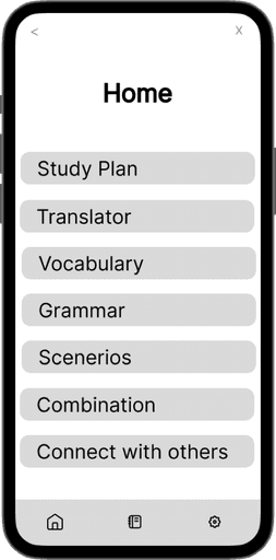


Footer with buttons allows the user access to the main sections of the app
Usability Testing
Three participants were asked to complete the same set of tasks, and the observations were categorized according to Jakob Nielsen's error severity rating scale. Below are the key insights, as well as improvements to be made for future prototype iterations.
Task 1
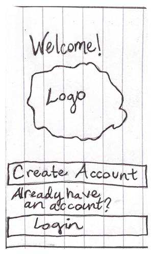
Go through onboarding & create new account


Initial Prototype: The initial prototype only allowed users to choose one language to learn and one reason for why they are learning a new language.
First Iteration: All of the language options and reasons why the user is learning a new language were made clickable, so that multiple languages and reasons can be chosen at the same time.
Future Iterations: In future iterations I would like to add an “Other” button for the reason why someone is learning a new language, in case the user’s reason isn’t one of the options provided.
Task 2
Self-select your proficiency level
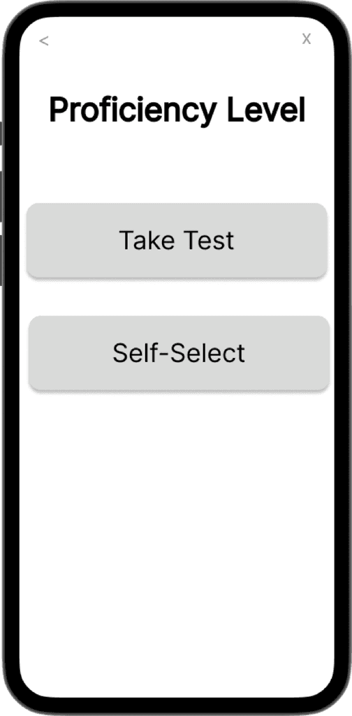

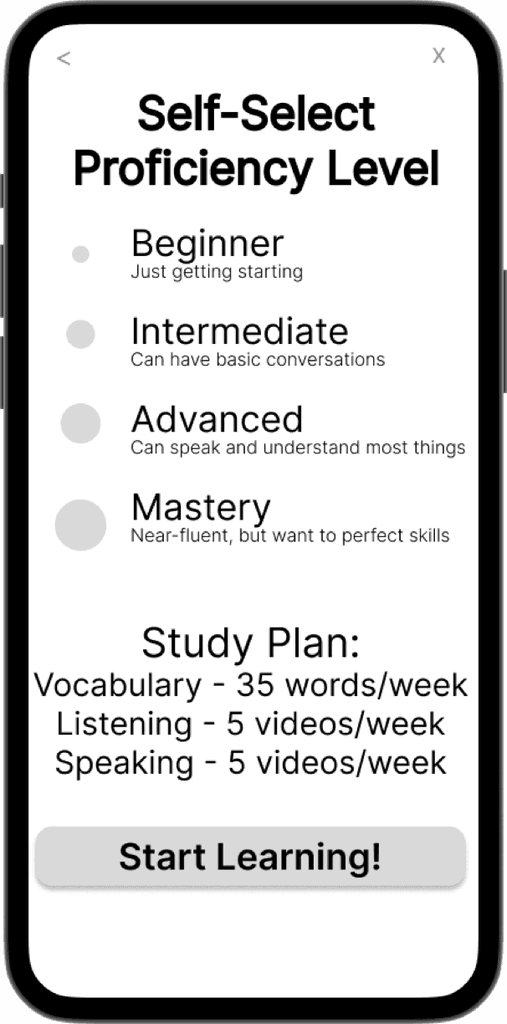
Initial Prototype: Starting out there were only the titles and ascending circles for self-selecting the proficiency level, but users thought that it was unclear.
First Iteration: Brief definitions were added for each proficiency level to decrease ambiguity.
Future Iterations: Users thought that it would be helpful if, after self-selecting your proficiency level, the app would take you to a new screen with an updated study plan based off of the chosen proficiency level.
Task 3
Upload a new word & add to a category

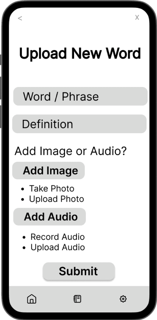

Initial Prototype: On the first prototype, the “Add Image” & “Add Audio” buttons looked more like text input fields, which confused the users.
There was also not a clear call to action when selecting a category.
First Iteration: "Add Image” & “Add Audio” were made to look like clickable buttons.
A “Done" button was added to provide the user with more clarity as to how to progress.
Future Iterations: Users mentioned that it would be beneficial if the app would auto-translate the new word/phrase, and then allow the user to edit it to their liking.
Task 4
Go through travel vocabulary exercises
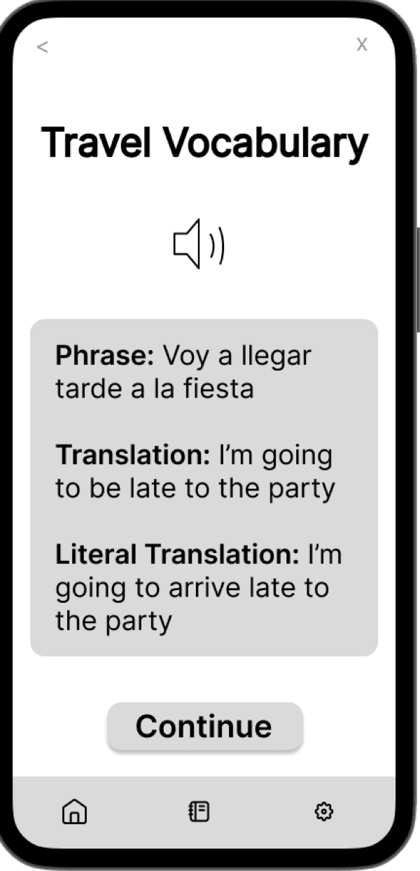
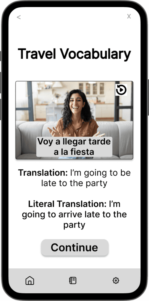


Initial Prototype: The first prototype didn’t have real words or definitions for the exercises, and the users found that odd and confusing.
“Great Work!” also showed up on the same screen as the question, which felt disjointed to the users.
First Iteration: Real words and definitions were added, in order for it to feel more like an actual language app.
A separate screen was added after the question, which clearly shows the correct answer and the words of encouragement.
Future Iterations: In future iterations, I would like to add more images to the exercises to make it more accessible to visual learners.
Insights & Reflections
Challenges
Usability testing was difficult in terms of finding a diversified sample of people that fall under the target audience
Identifying the most intuitive user flow proved to be challenging
There’s a delicate balance between providing enough customization options on the screens for the users, while ensuring it doesn’t feel cluttered
Achievements
Overall, the users expressed positive feedback in regards to the flow throughout the app
They felt that the process of adding a new word & going through vocabulary exercises was very intuitive
The users liked the option to add an image or audio when creating a new flashcard
There were many insights gleaned during user testing, which was extremely valuable in improving the flow, as well as gaining a better understanding of what additional features would be helpful
Future
Implement AI chat bot & other methods for users to connect with real people
Transition future iterations into refined, high fidelity prototypes, based off of user feedback
Add more varied exercises to accommodate a broader range of user’s learning styles
Increase the instances of positive encouragement throughout the app
Additional user testing for continued feedback & improvements